the design

questioning why?
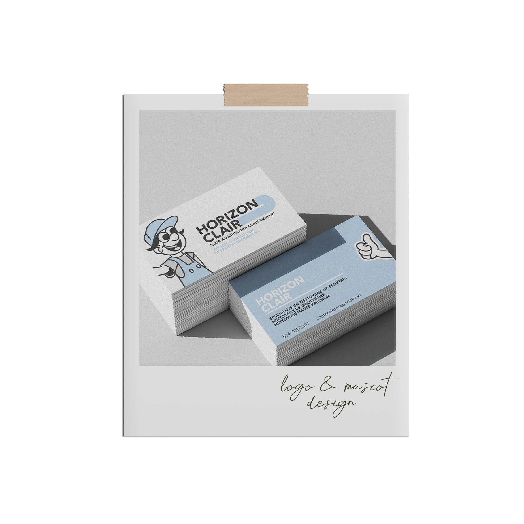
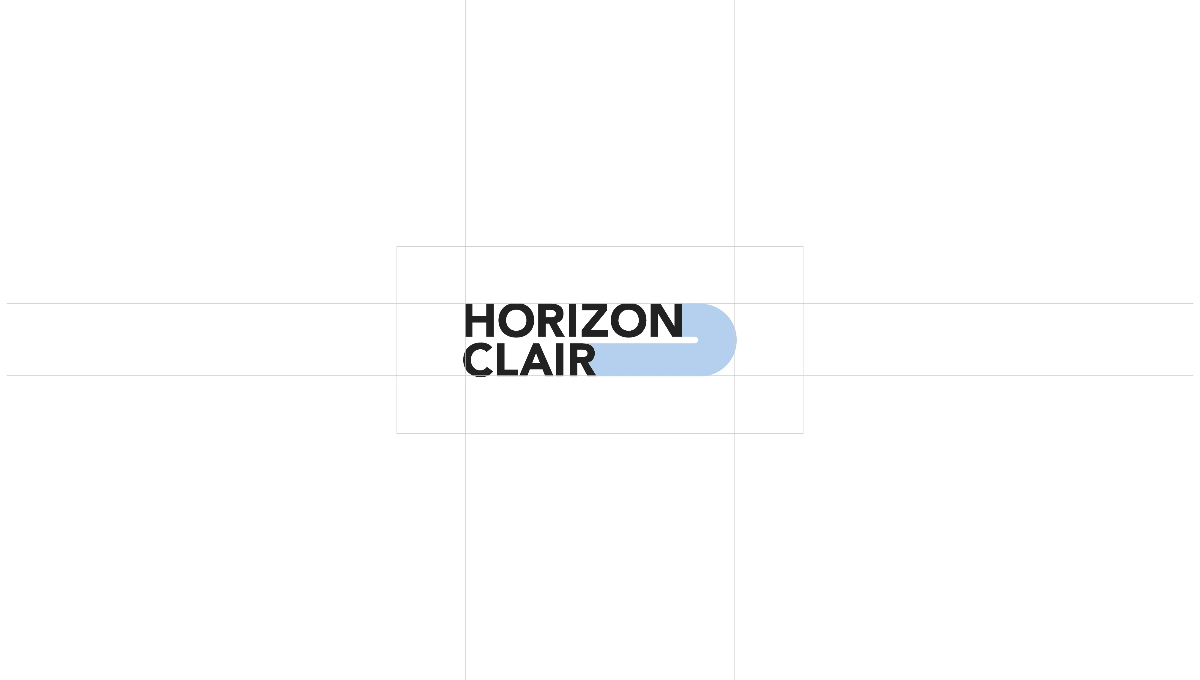
When José and Samuel reached out, they were looking for a quick delivery of a logo. We started with a name and general feeling, and from there we created a clean, geometrical logo that played with the idea of the sweeping motion of a squeegee and the rectangular shape of a window.
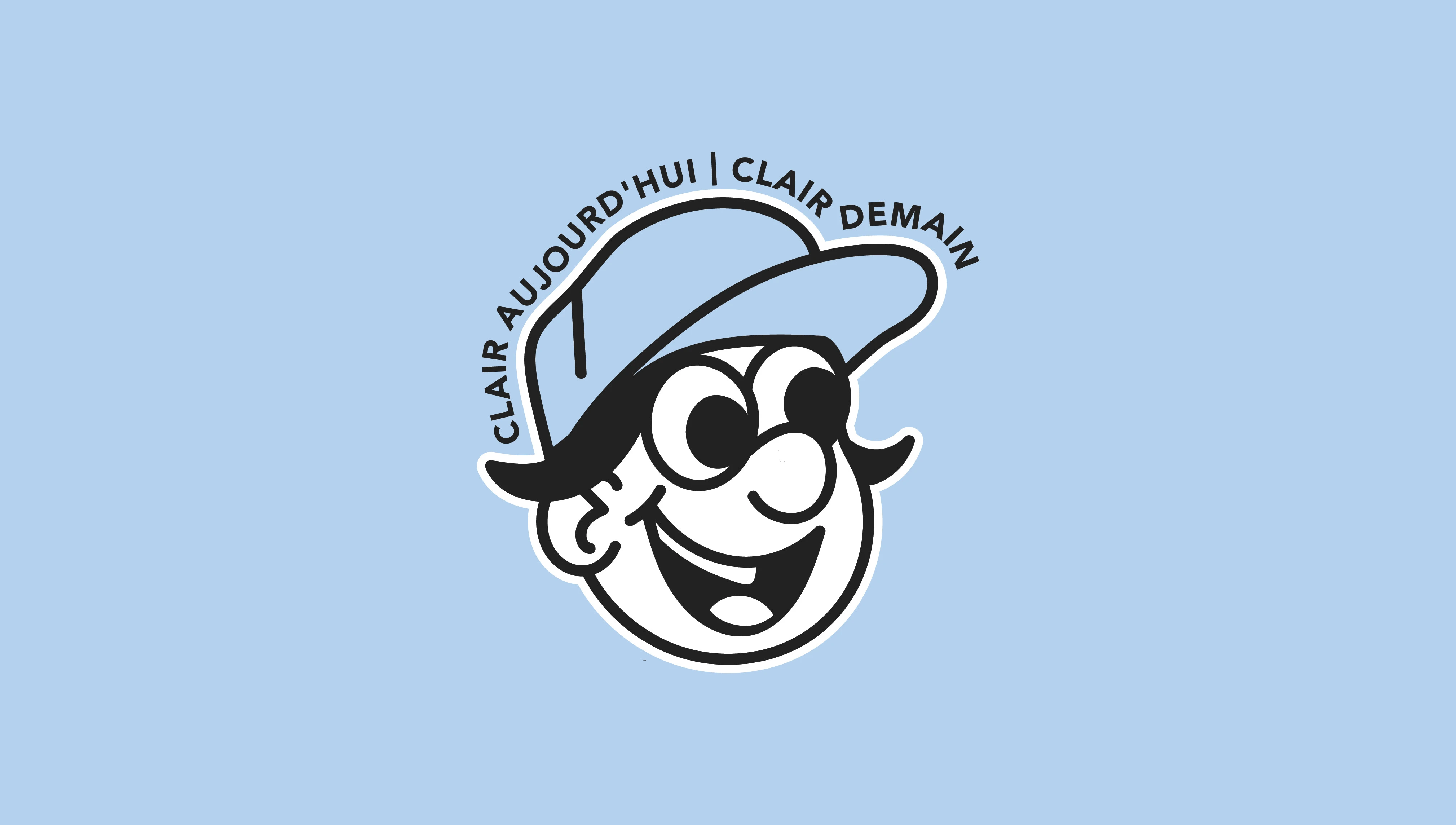
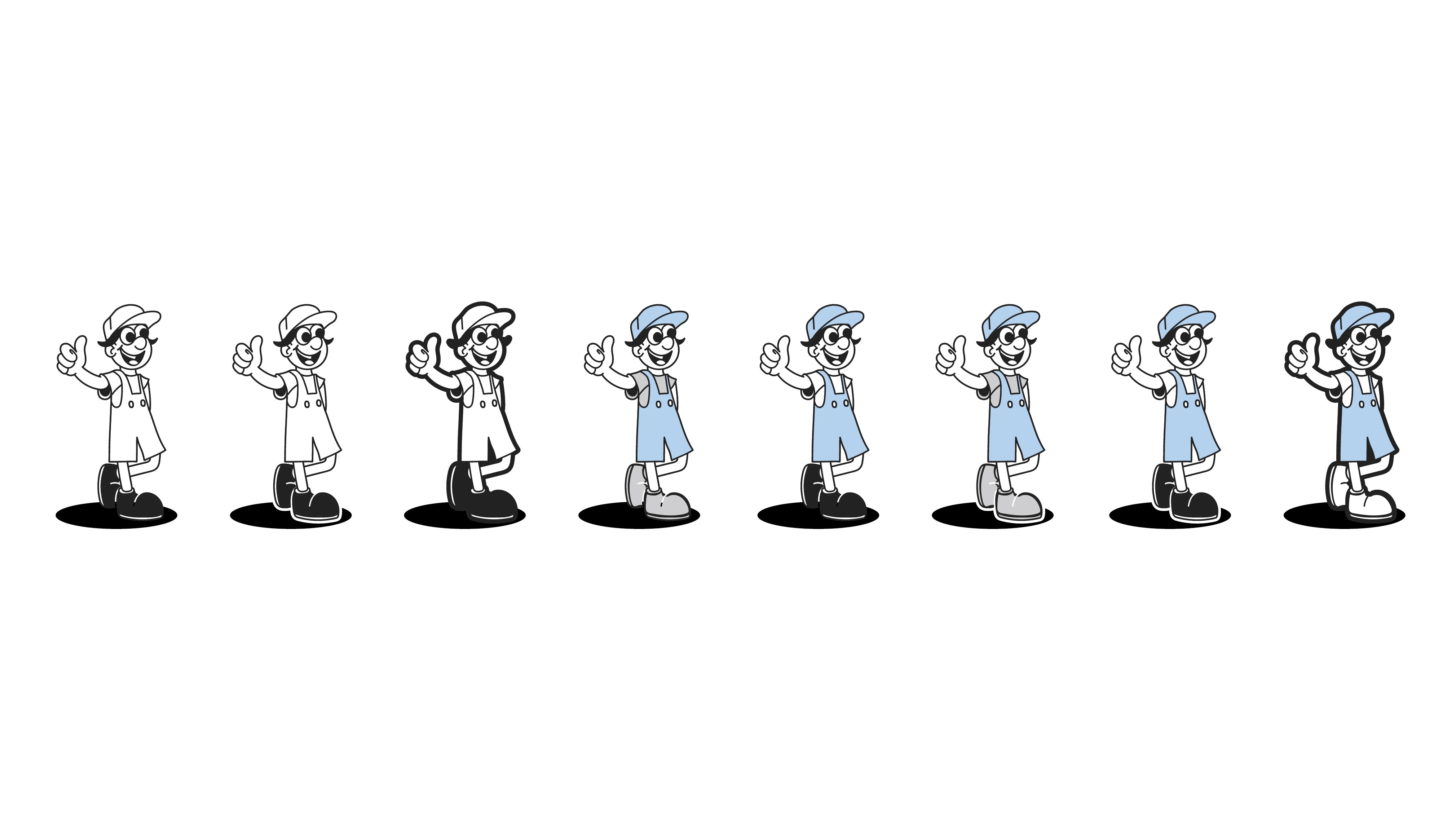
They also expressed interest in creating a mascot, wanting to convey both trust and friendliness through a distinct and unique illustration. Again, striking a contrast with the more structured logo, here we see softer lines and the more personal side of the brand.
the application
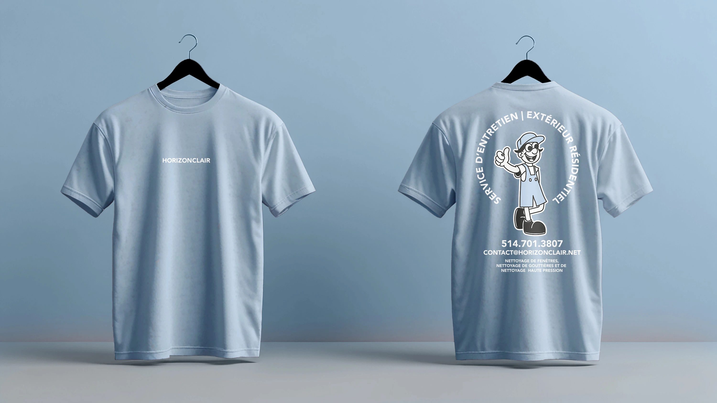
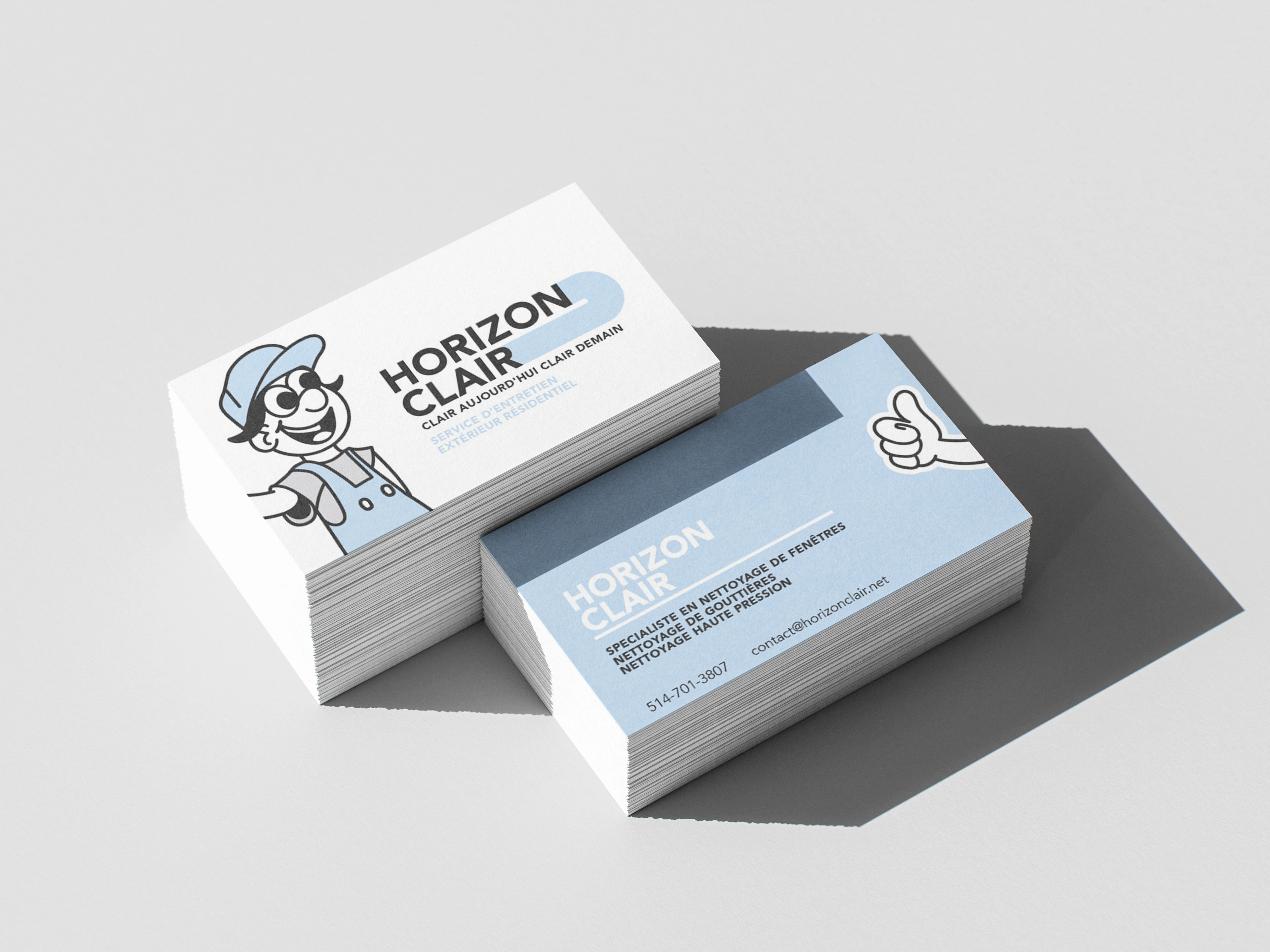
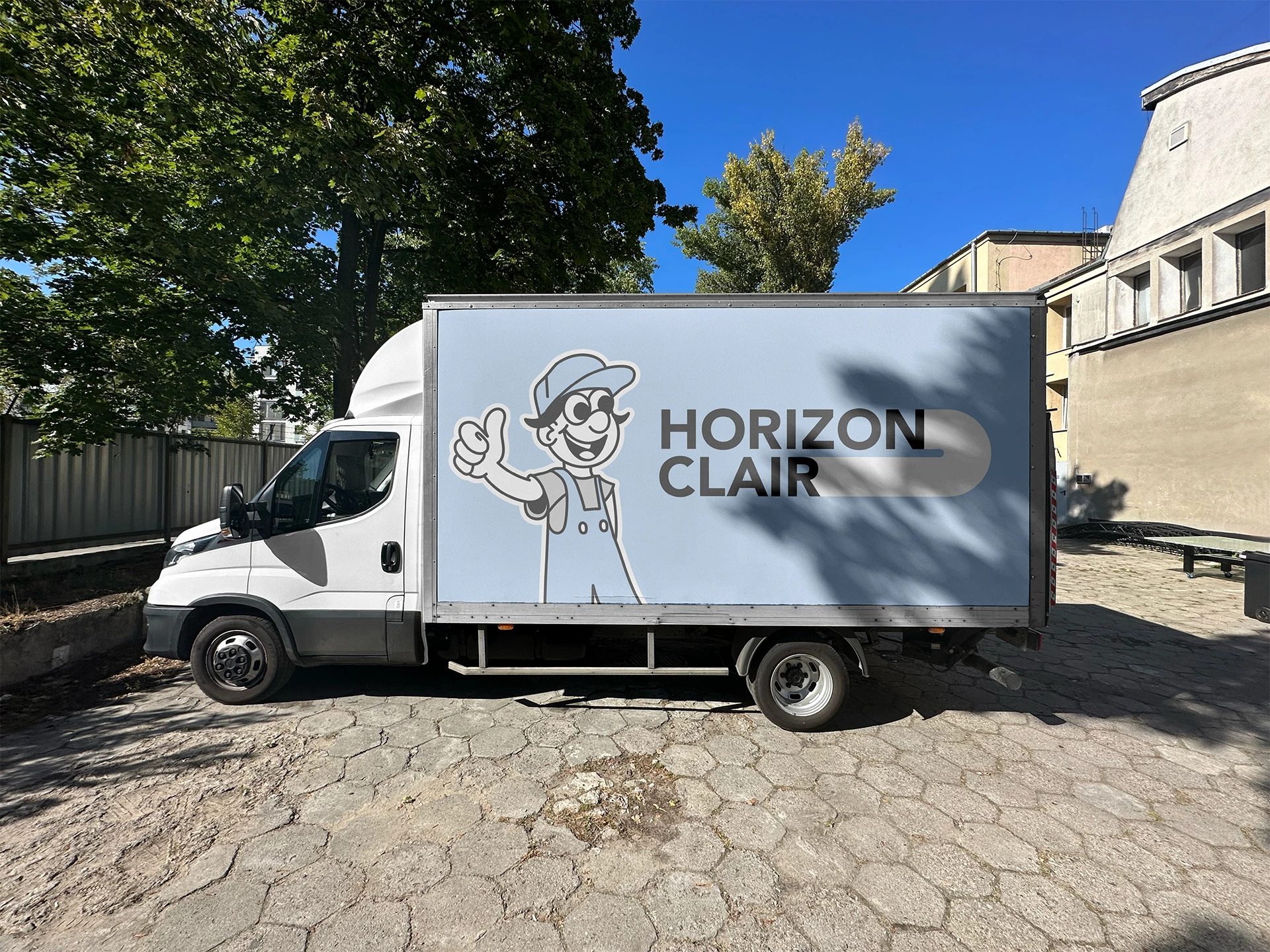
business cards & merch
It was clear that the team wanted the brand to remain eye catching and playful all while balancing professionalism in the applications. With the business card in particular, we see the mascot play with the application by wrapping around. In the t-shirt application the idea of clear sky is graphically shown through the circular (sun-like) form created by the text.